

The Shapie Journal
How to Choose Wall Art Colours That Work With Your Room
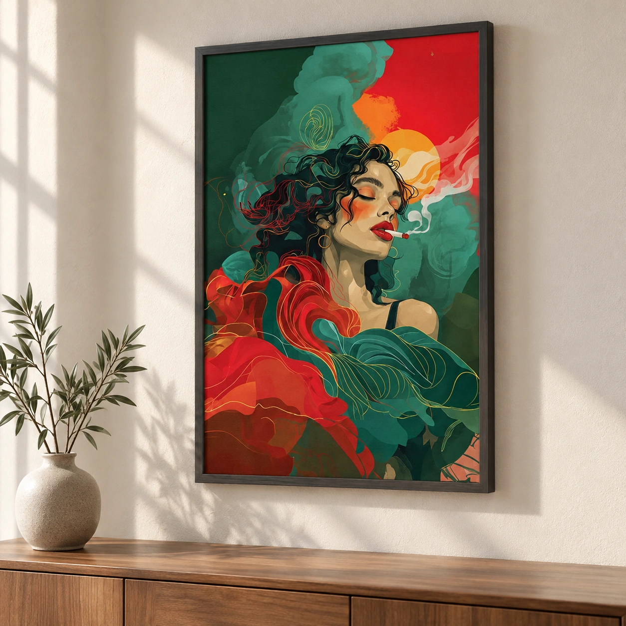
The easiest colour to work with may already be in your room. It might be the tobacco brown of a chair, the green of a plant or a blue thread in a rug. Look for one colour you enjoy seeing, then see what happens when an artwork picks it up in a different shade.
Echo a colour you already like
If your sofa is deep blue, a painting with a little blue in the background can feel at home without making the room feel matched. The same works with materials. A painting with sandy tones can sit comfortably near pale oak even when the shades differ.
Take a photo of the wall and furniture in daylight. Put the artwork image beside it and look at both from arm’s length. That quick check helps you see whether the colours connect before you get distracted by details.
Use contrast where the room needs energy
If the wall and furnishings are close in colour, decide where you want the eye to land. A darker piece can give a pale room a centre of attention. In a dark room, lighter areas in a canvas can draw the eye without changing the wall colour.
Keep the contrast you enjoy looking at. You can repeat one small colour elsewhere in the room if it helps the painting settle in. A strong red might need only a book spine or a cushion, especially if the artwork itself is large.
Judge the colour again in the evening
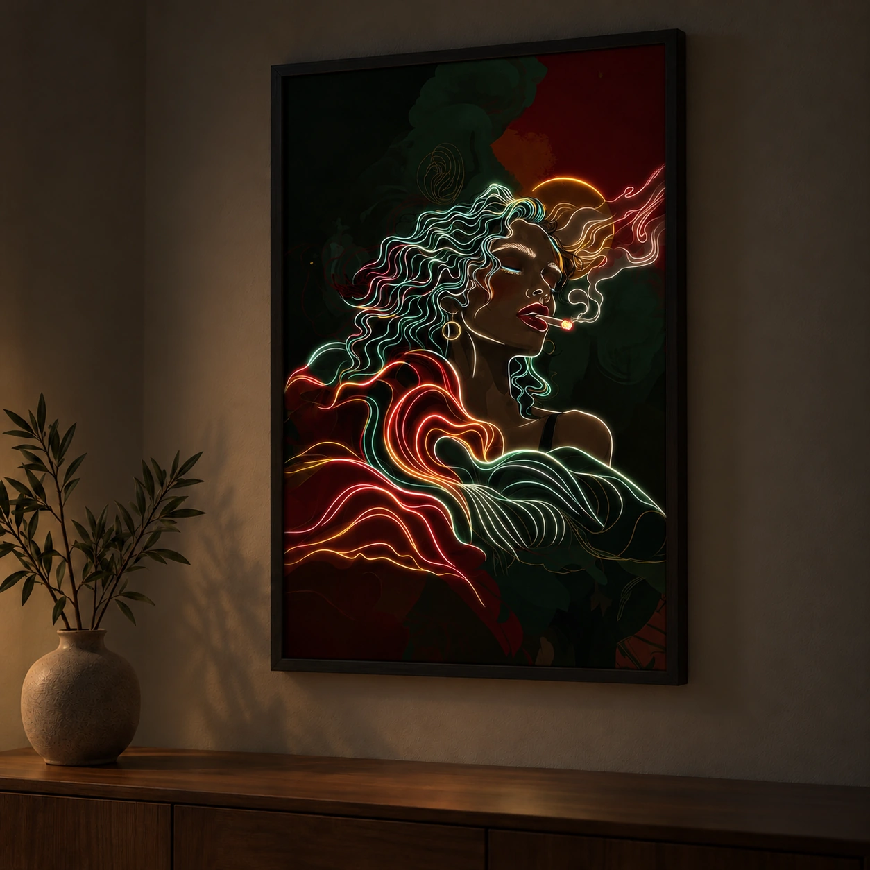
Look at the wall when the lamps you normally use are on. A warm light can make some colours feel softer and others less distinct. With LED wall art, compare the gallery’s night image as well. The canvas may have one dominant colour by day and a very different set of details after dark.
If two designs feel equally good in daylight, choose the one that still suits the room at the time you spend most in it. The room-by-room wall art guide can help you check the rest of the fit.